the brief
Fulcrum is a career and placement platform. Growth needed a way to reach people before they had a reason to sign up, and something light enough to open out of habit.
Daily Drop is that surface. A self-contained puzzle that stands on its own, with Fulcrum's brand and sign-in kept to the edges rather than pushed up front.
That framed two design problems. Build a daily object people return to without a prompt, and give it a brand elastic enough to hold very different tones while the product was still finding its position.
Fulcrum needed to reach students before they had a reason to sign up.
How might we make something worth opening every day, that brings new students in?
motion for the loading states
Loading and scoring are short enough to waste, so they carry brand instead of a spinner. Five looping states, each tied to a moment in the flow, from the wordmark building on open to the day's box tipping in.
the format of a drop
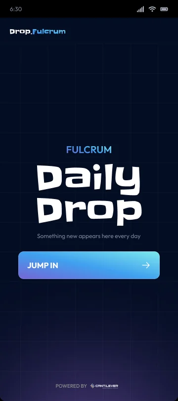
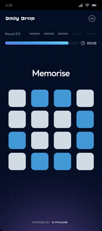
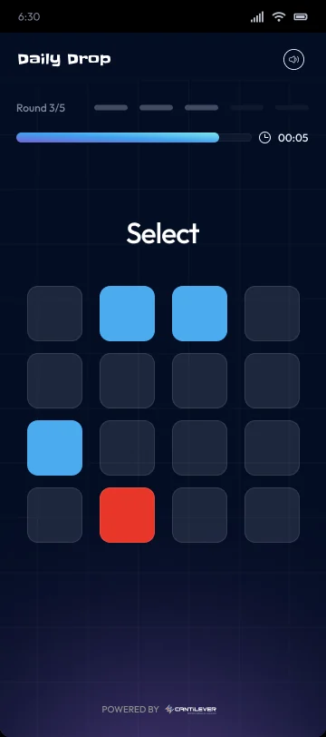
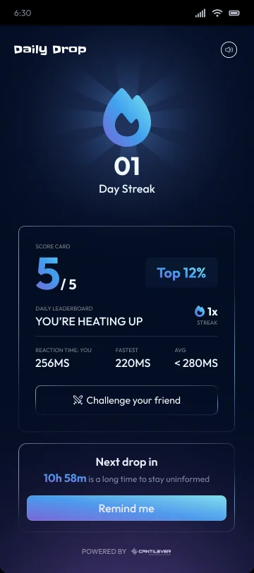
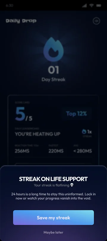
A drop is a fixed sequence of timed rounds. Each round is one puzzle from a shared library, and the sequence closes on a scored result. The shell stays constant so the rounds are free to change. Below is one run on mobile, from the day's landing to the nudge that brings you back.
a library of round types
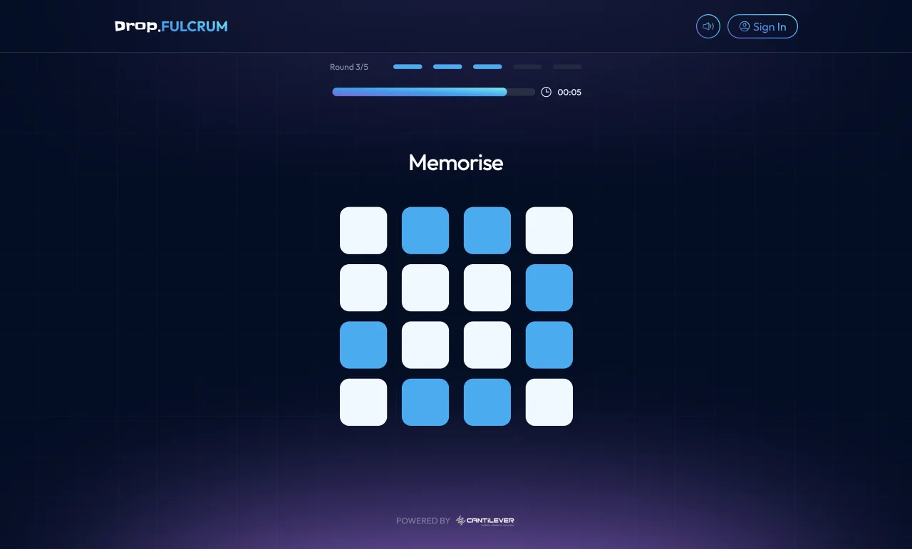
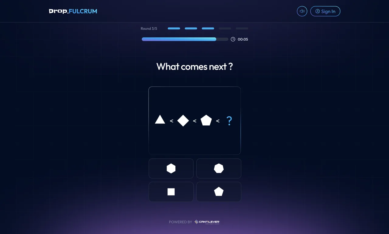
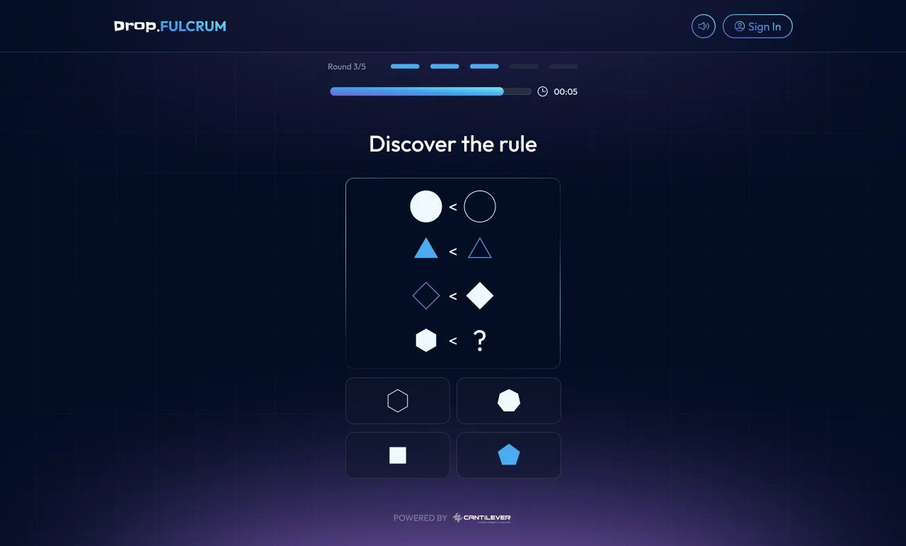
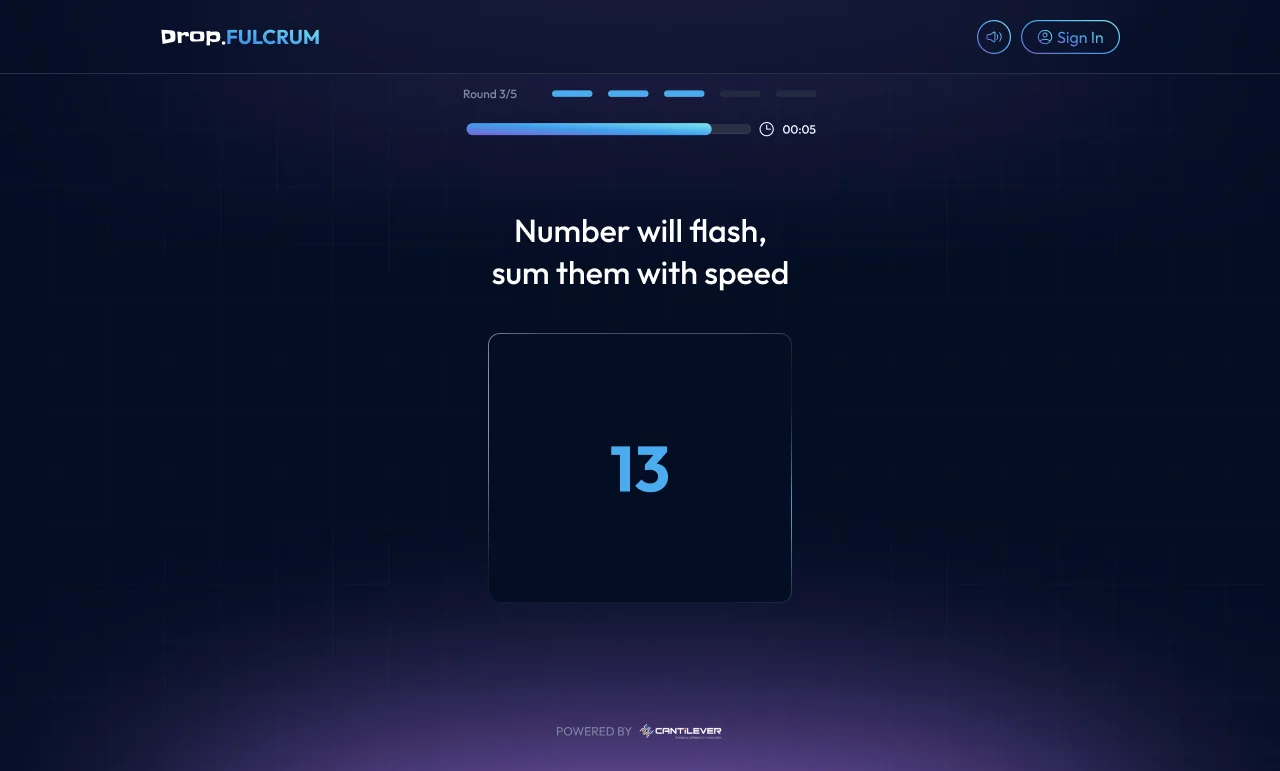
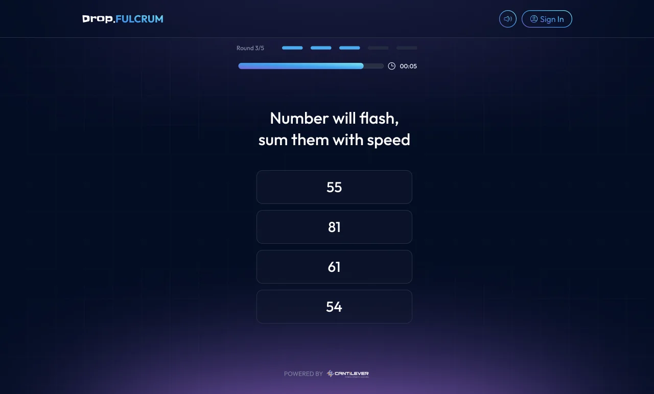
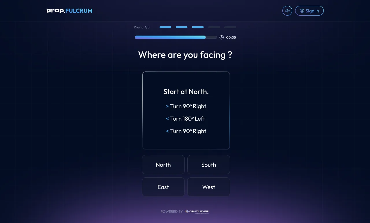
Rounds are drawn from a library of self-contained puzzles across memory, logic, arithmetic, pattern, probability, language, perception, and judgment. Each is a distinct interaction that has to read and resolve in a few seconds, inside the same round shell. Shown here on mobile.
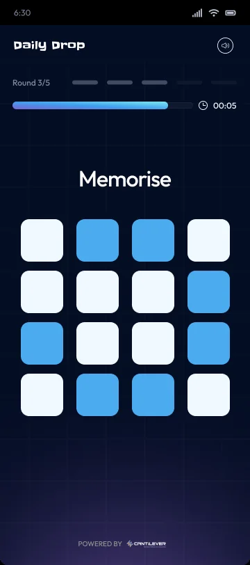
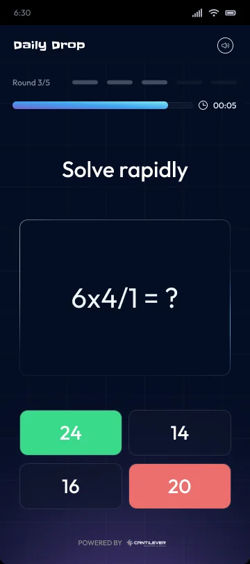
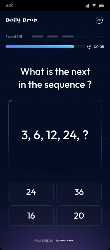
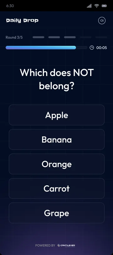

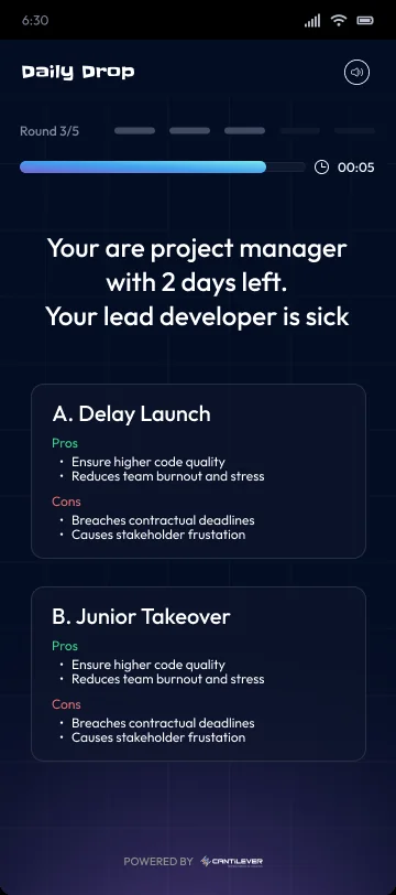
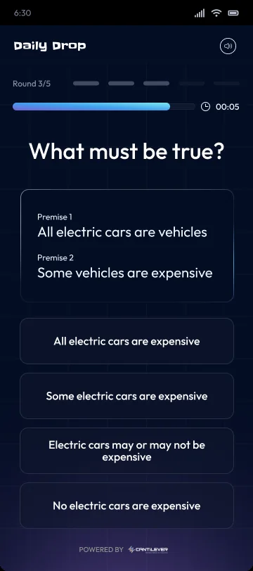
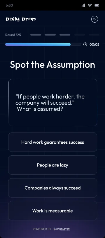
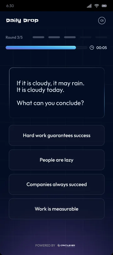
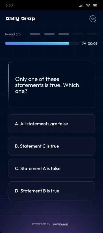
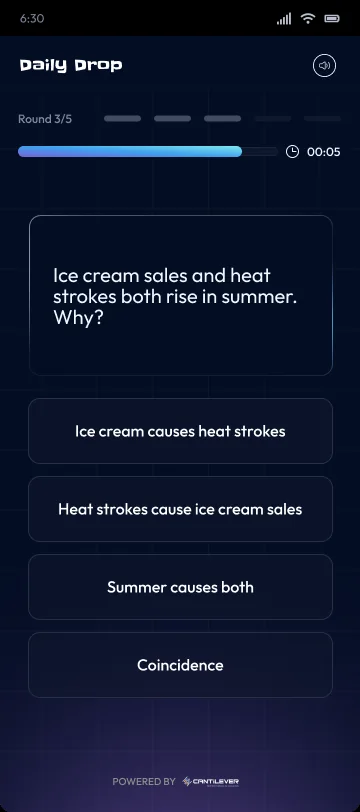
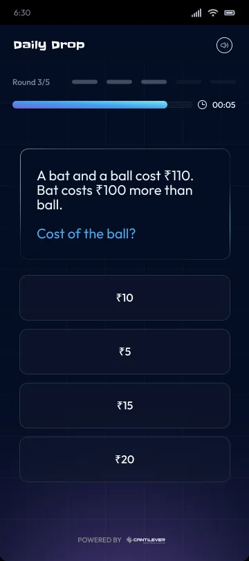

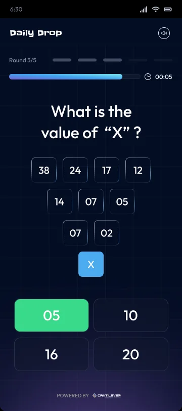
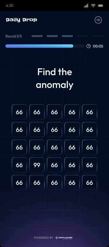
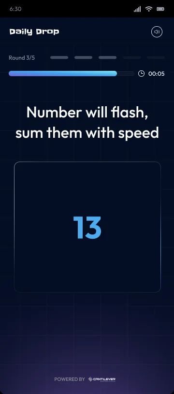
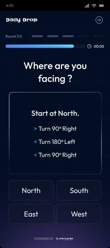
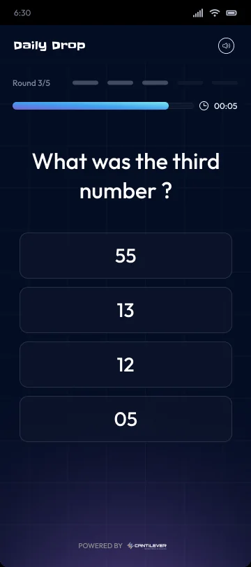
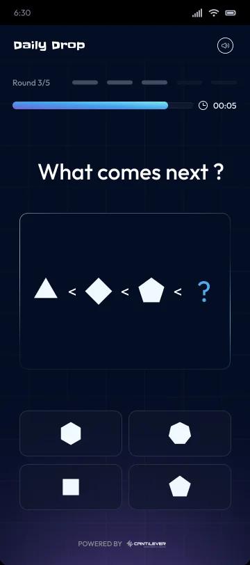
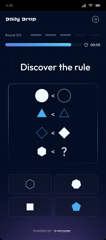
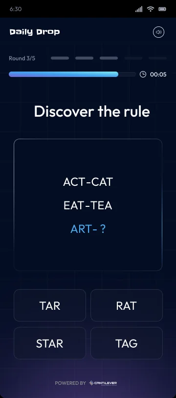
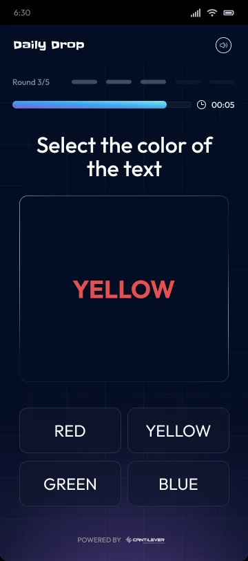
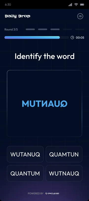
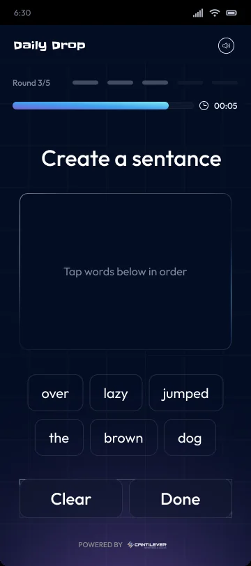
The same set runs on the web too, matched type for type, so a drop reads the same on a phone as in the browser. Those screens are further down.
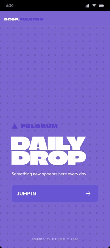
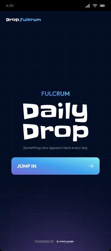
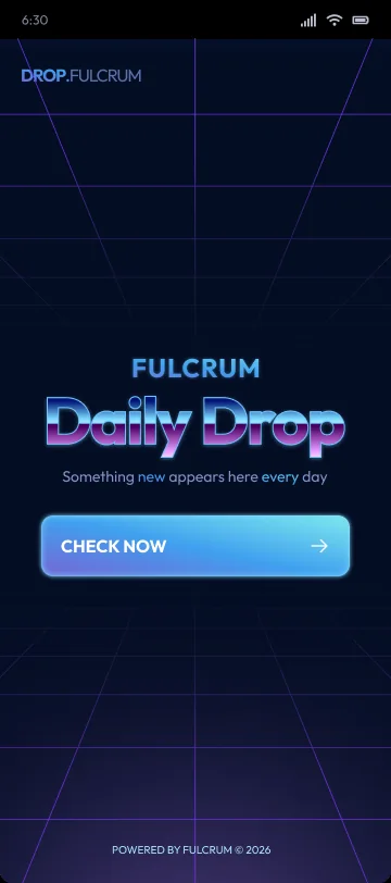
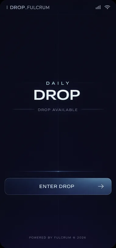
directions for the landing
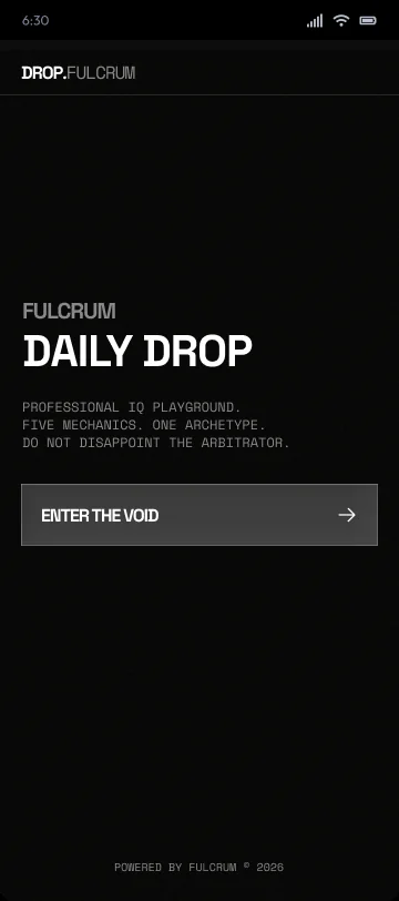
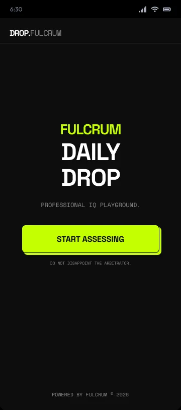
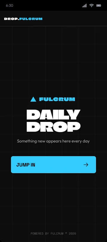
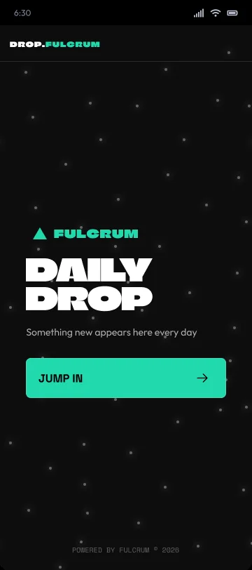
The landing is the surface that has to earn a first tap, so its tone was the variable most worth testing. These are directions explored for it, from restrained and typographic to expressive, including a mascot the product could speak through.






the result, and how it spreads
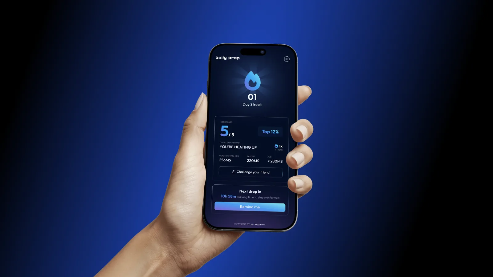
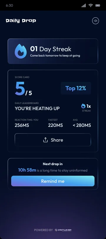
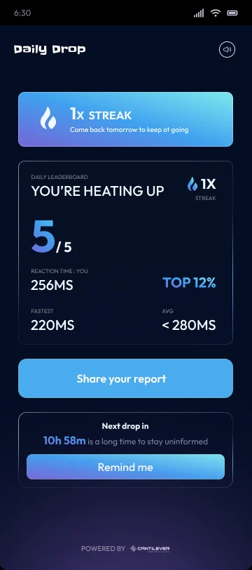
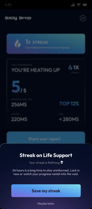
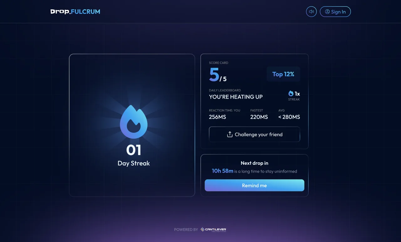
The result is the product's growth mechanic. It is scored, labelled, and laid out to hold up as a screenshot, with a streak to justify returning and a challenge to hand it to someone else.

the same system on the web
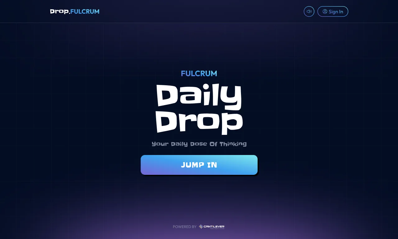
The web build runs the same rounds and the same result on a wider canvas. The round shell, a few of the types, and the result, drifting past below.
what I took away
The biggest lesson was how little a daily product can afford to ask. Anything that added a second of friction to a round worked against the habit, so the work became mostly subtraction, and I got more comfortable cutting things that were good but not necessary.
The other takeaway was about systems. Holding the round and result structure steady is what let the landing swing across so many tones without a rebuild. Get the shell right and the brand can be loud or quiet on top of it, and that separation is worth setting up early.