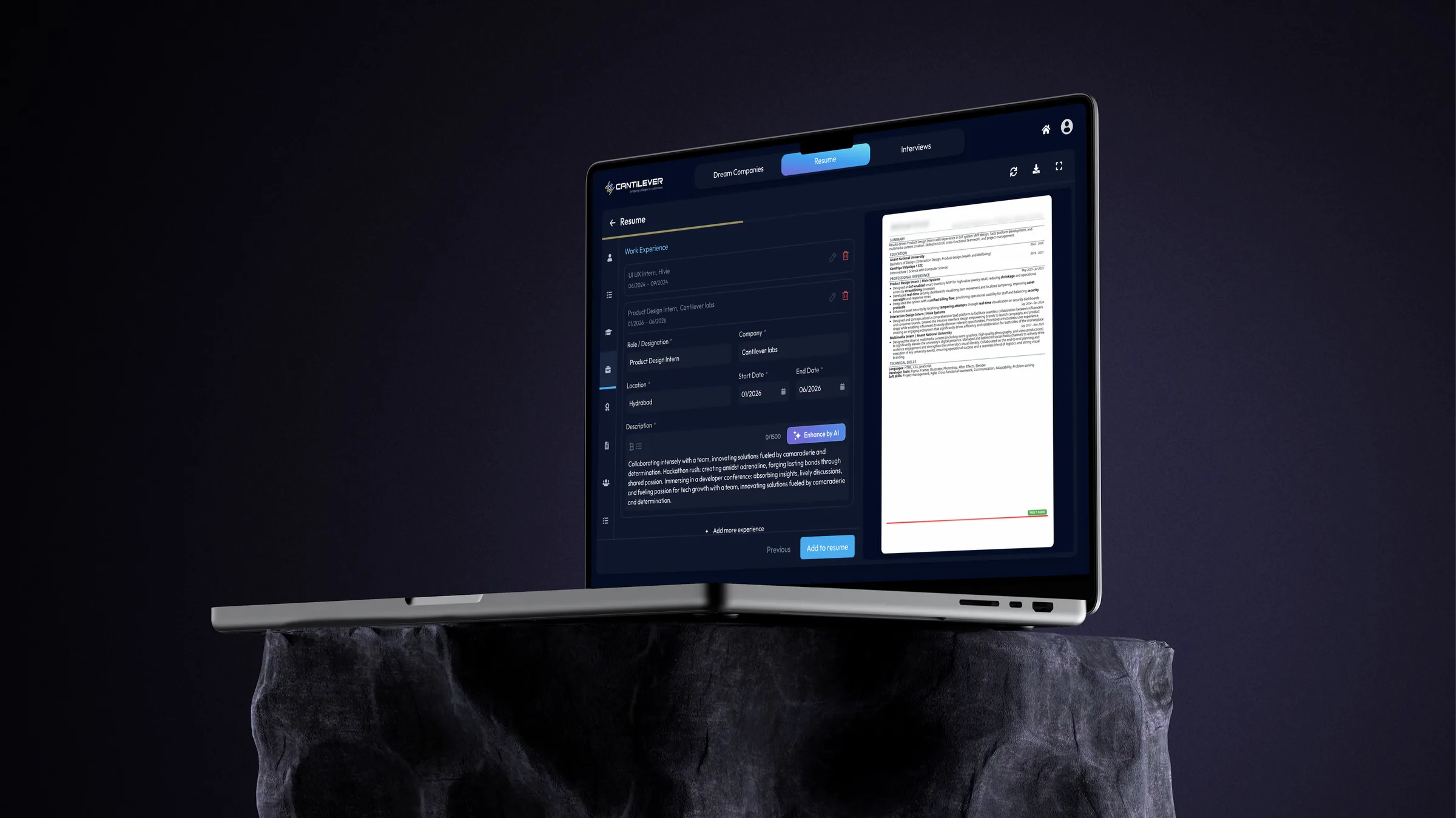
About Fulcrum
Fulcrum is an AI-powered placement platform helping students prepare for campus placements through resume building, interview preparation, and career readiness tools, while enabling institutions to monitor student progress.
Adding experiences to a resume was slow, repetitive, and easy to get wrong.
How might we make building a resume quick, clear, and effortless?
Finding the friction
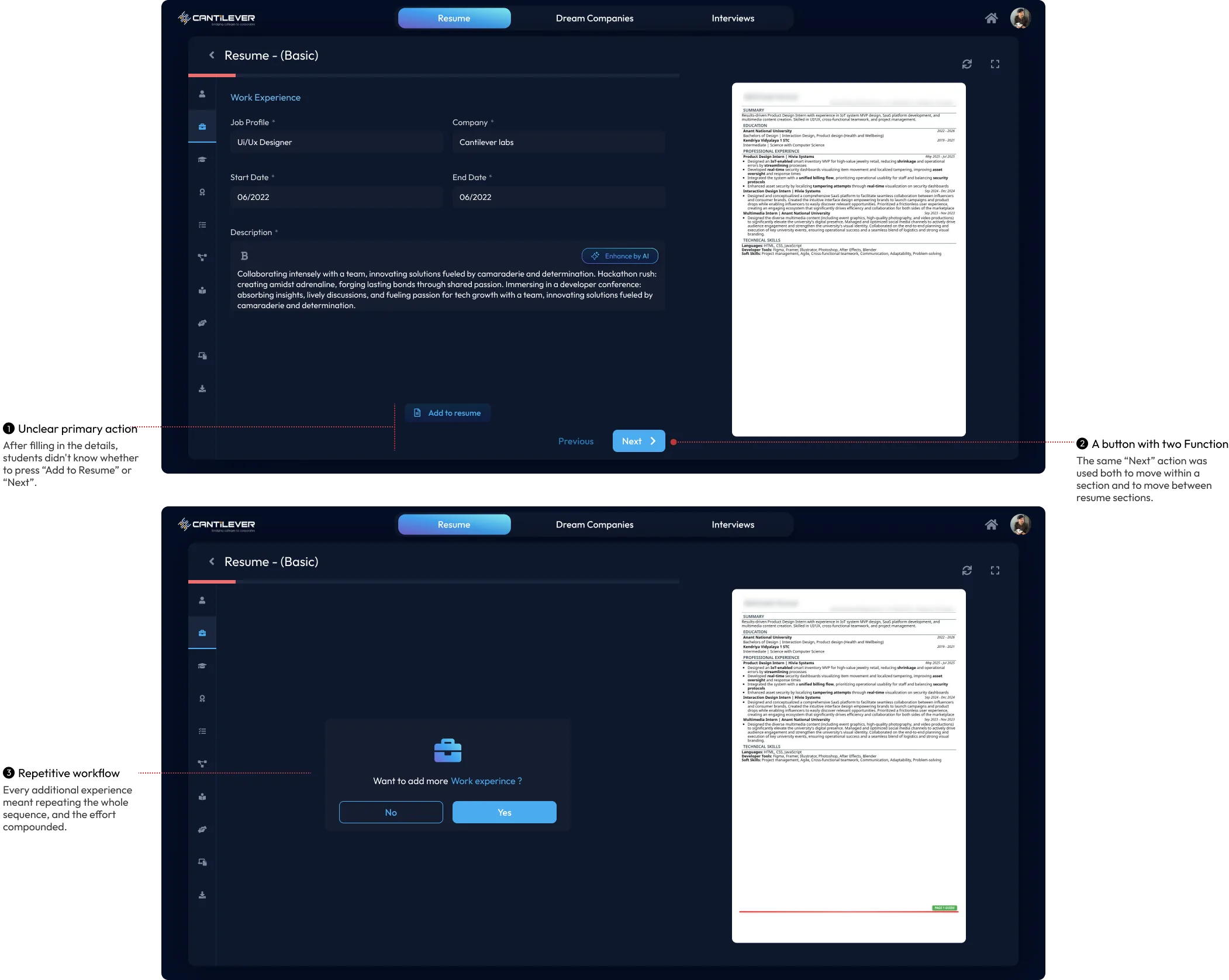
The Resume Builder required students to save information through separate actions, creating repetitive and unclear workflows.
Key issues identified
-
01
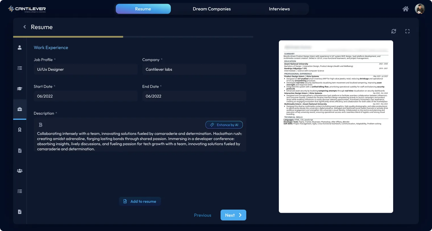
Unclear primary action between “Add to Resume” and “Next” buttons.
-
02
A single button serving two conflicting purposes.
-
03
Excessive steps required to add multiple entries.
-
04
Difficult navigation to manage existing entries across separate screens.
Validating
Testing with students confirmed the same friction points: hesitation between actions, and uncertainty about whether work had been saved before proceeding.

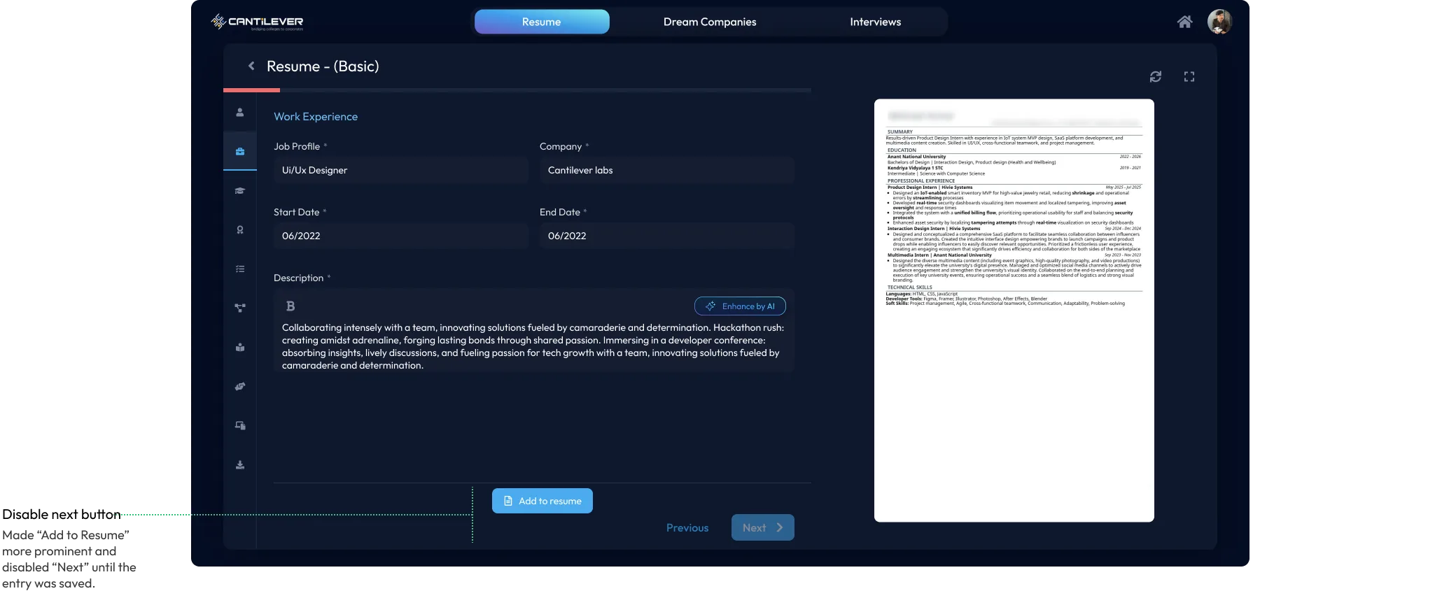
The quick fix
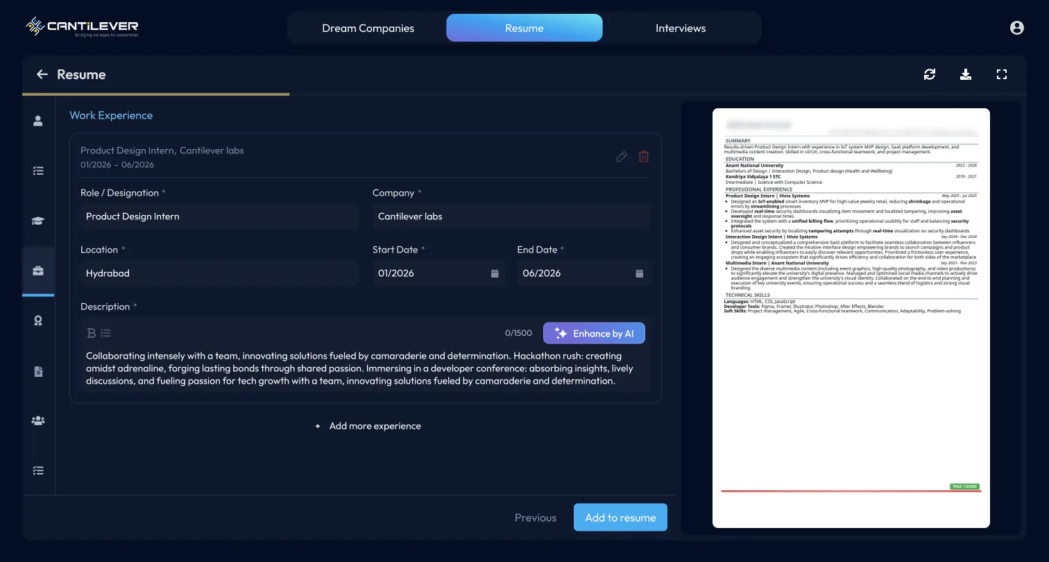
Made “Add to Resume” more prominent, and disabled “Next” until the entry saved successfully.
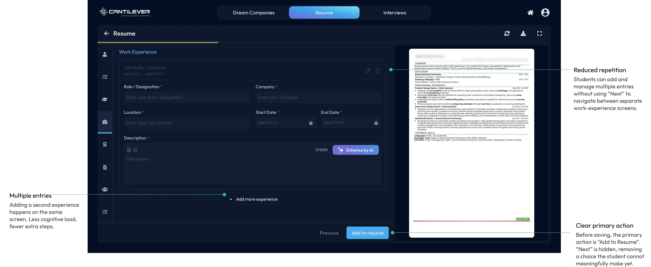
Rethinking the entire flow
Consolidated all work experiences into a single section, eliminating “Add to Resume” and using “Next” for both saving and progression.
- Fill entry
- →
- Add
- →
- Next
- →
- Add another
- →
- Repeat
- Manage all entries
- →
- Click Next
- →
- Save
- →
- Continue
The engineering reality
The system treated saving resume data and progressing as separate operations. Combining them required significant architectural changes.
Designing around the constraint
Preserved the unified entry view, while keeping save and navigation as distinct operations visually.
Only “Add to Resume” is visible.
Add to ResumeA toast confirmation appears, and the primary action changes to “Next”.
Saved to resume Next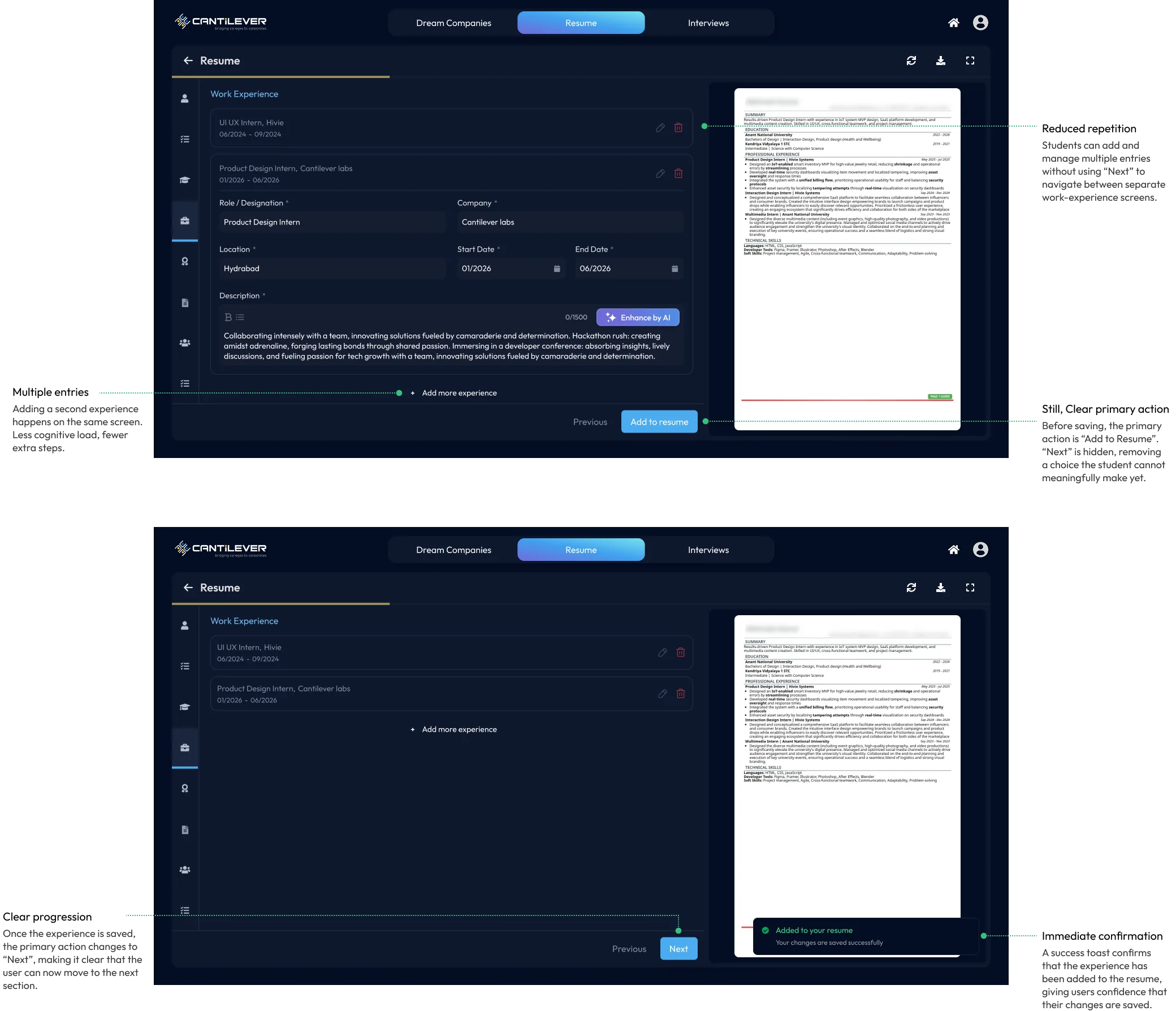
Outcome
-
67% 32%
Testers reporting UX & flow issues, across two feedback rounds.
-
02
Reduced friction when adding multiple experiences.
-
03
A higher resume completion rate, with less time spent getting to a finished resume.
Key learning
“Good design balances user needs, technical realities, and business goals.”
, rather than pursuing an idealized solution disconnected from practical constraints.